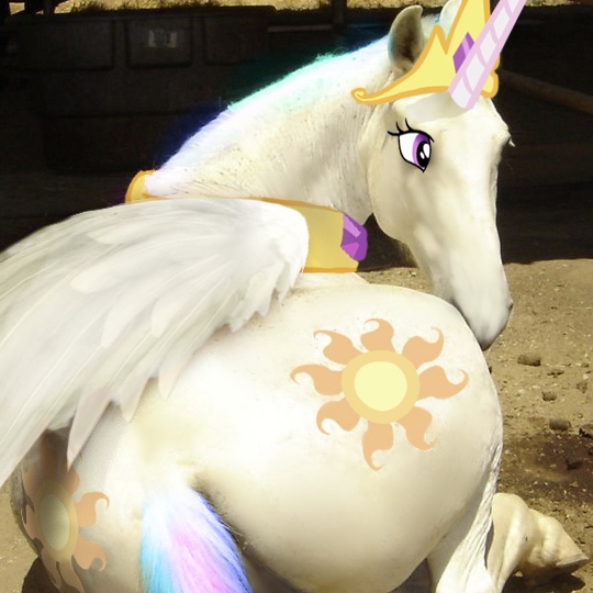
@Princess Celestia
Ah. I got this impression from what looked like the top of windows in a taskbar in the bottom and the odd scritches of color on the right. I didn’t think to apply that thought to the grey bar at the top, though. Amazingly ironic that the exact amount left in the screenshot was able to line up the vertical spaces perfectly…
Annnnnd I completely understand that sort of victory… Granted, I’ve never done anything on the scale that’s being worked on here, but still. Programming layout can get feisty, fast. Congratulations on getting this far! Because I surely didn’t get across the notion before, I’ll say clearly now: I don’t appreciate it as a comparative, but the site design showcased in that screenshot does look nice. It’s sleek, effective, coordinated in its own right, and does do a lot of things very well.
And my apologies that you have to repeat yourself, but that does put a lot of my concerns at ease.
That sounds like a lot of neat options already, too! I’m sure being able to choose between light or dark of various colorschemes will be a lot of fun to some people. And I’m so glad to see that left-alignment isn’t getting defenestrated! I was worried about that as well after seeing the proposed redesign, to tell the truth, especially when remembering a concrete-sounding reply to someone who questioned if Furbooru would have a left-align option.
I understand that it’ll sound trite now, but I would also like to say thanks for the amount of continuous work you guys do in regards to keeping the site running and fixing its ragged edges. And just as much for the leniency extended towards things like the potential copying of avatar border design - or the fact that that’s a donator reward, rather than important site function or convenience being paywalled.
Honestly, the fact that the site is still growing and changing to this day, with or without complaint, is cool AF.


.")


 - Took part in the 2020 Community Collab")


 - Celebrated Derpibooru's seventh year anniversary with friends.")


 - Celebrated Derpibooru's six year anniversary with friends.")


 - Celebrated Derpibooru's five year anniversary with friends.")


")